
You can style the shop page where all your products are listed. This can be your main shop page or the product archive page.
Quick Steps on How to Style WooCommerce Store Page Using the WooCommerce Module
Step 1: Make sure you have the Astra Pro Addon and WooCommerce plugin installed and activated. How to Install Astra Pro Addon plugin?
Step 2: Activate the WooCommerce module from the Astra Pro Modules under the Astra > Welcome
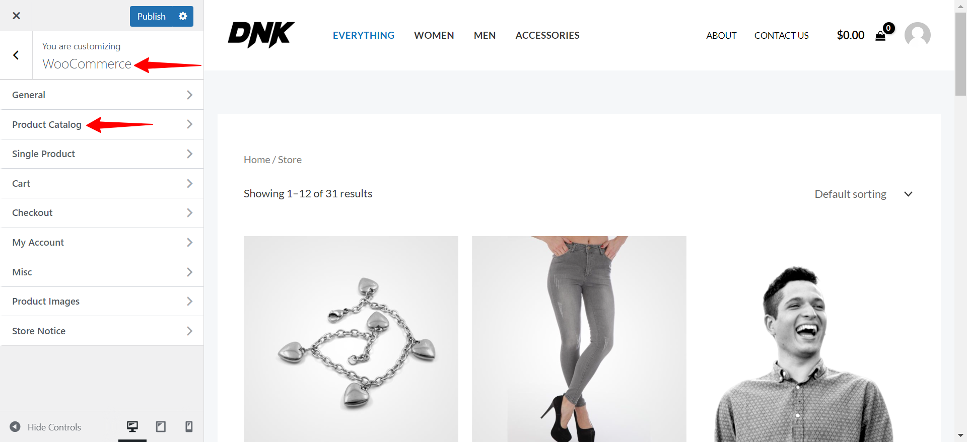
Step 3: Visit customizer [ Appearance > Customize > WooCommerce ] to edit module settings
You can find the settings under Appearance > Customize > WooCommerce > Product Catalog
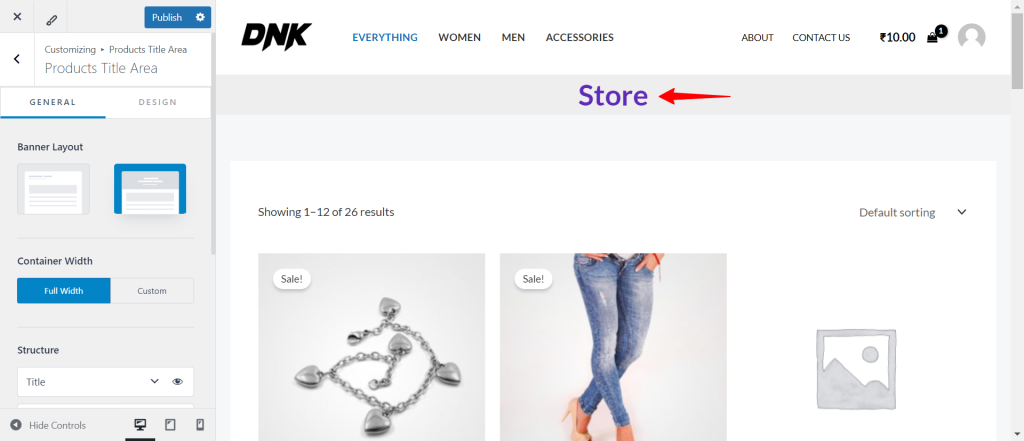
Product Title Area
In the General Settings, you’ll find a toggle for the Product Title Area. This option allows you to control the visibility and layout of the title area for each product on your site.

When you enable the Product Title Area toggle, the title area for that specific product becomes visible. This gives you the flexibility to further customize how the title area appears on your product pages.
Once the Product Title Area is enabled, you can select various options to customize its appearance:
- Banner Layout: Choose how the banner layout should be displayed.
- Title: Control the visibility of the product title.
- Description: Control the visibility of the description.
- Breadcrumbs: Choose to show or hide breadcrumbs for easy navigation.
These settings allow you to tailor each product’s presentation to better fit your overall website design and branding.
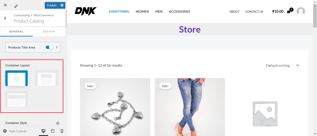
Container Layout
Astra offers 3 types of Container Layouts. These container layouts will be applied to your website’s store page. But you can set different container layouts depending on your requirements.
Here is the list of available container layouts.
- Default
- Normal
- Full Width
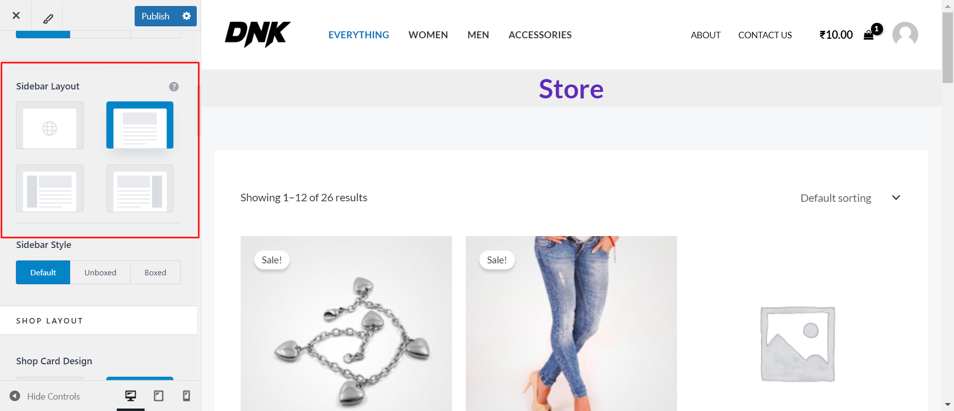
Sidebar Layout
Under the sidebar layout, you will notice 4 options
- Default
- No Sidebar
- Left Sidebar
- Right Sidebar
To make your sidebar visible, you will need to set the layout to either Right or Left, depending on your requirements.
To disable the sidebar, select the “No Sidebar” layout.
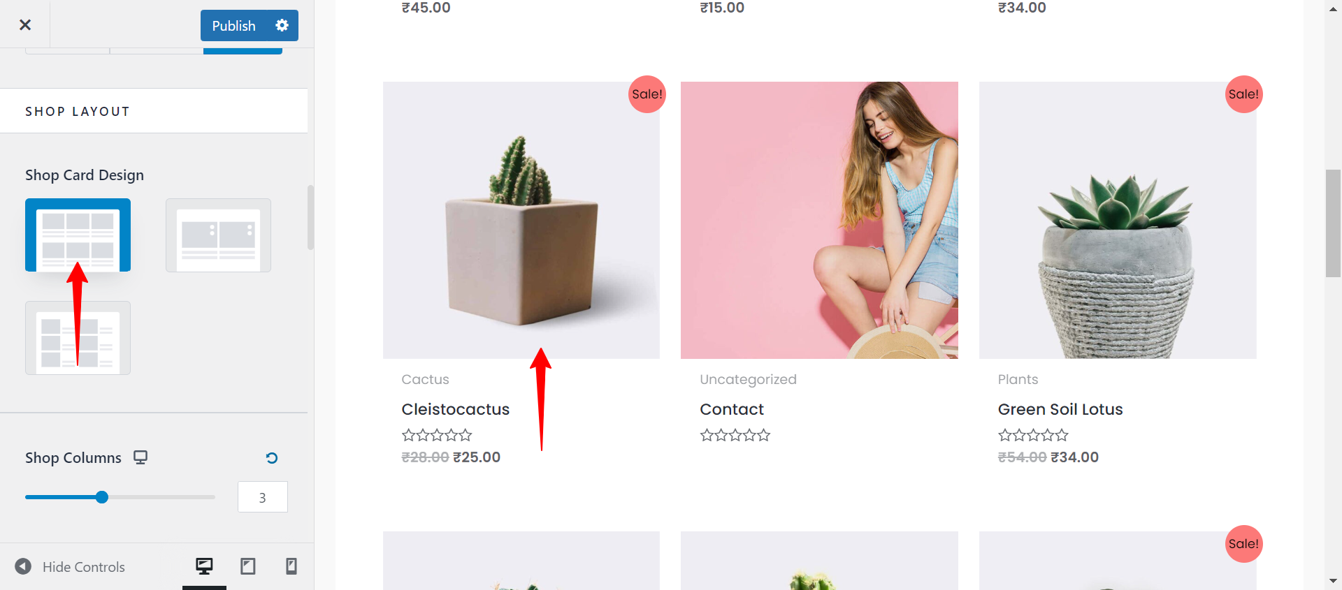
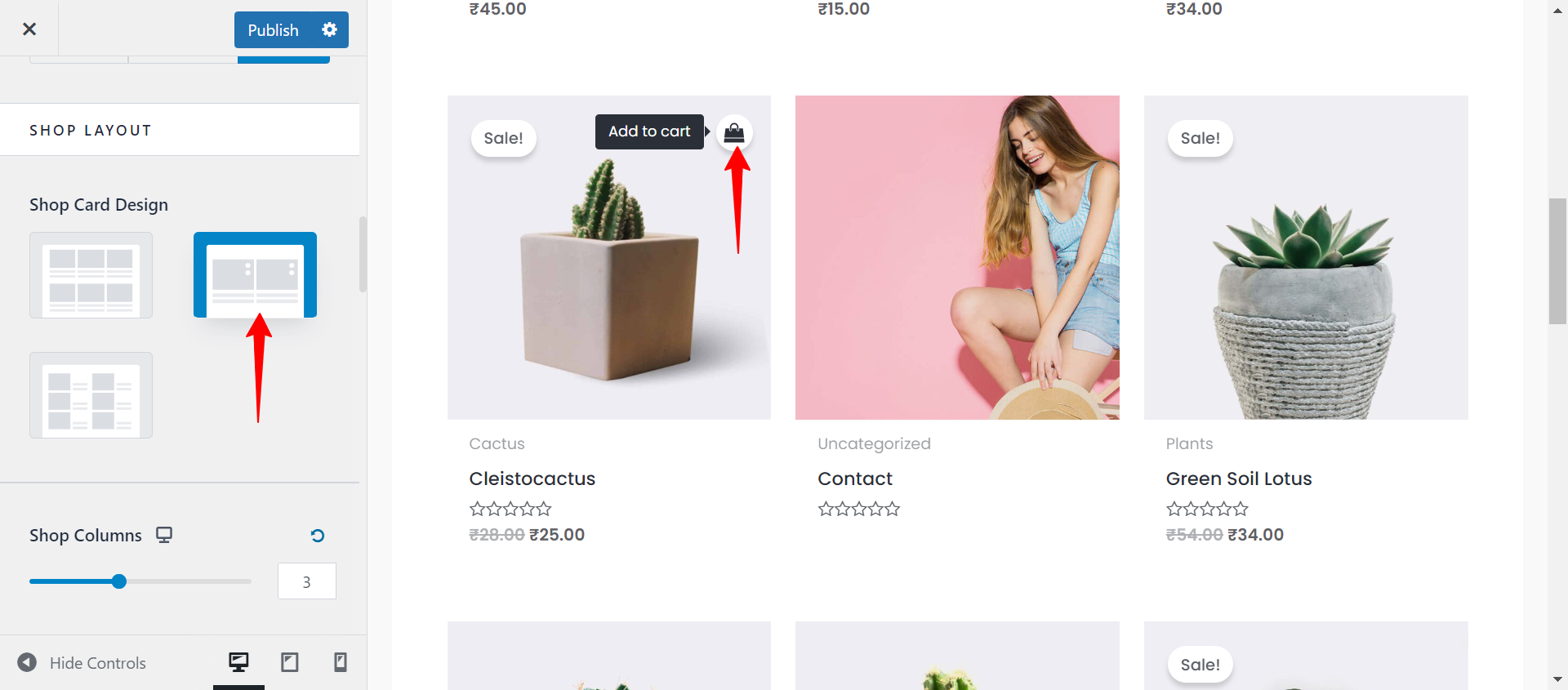
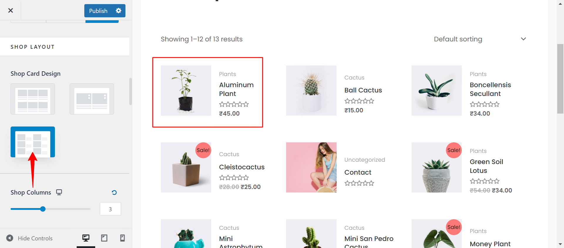
Choose Shop Layout
Within your website’s customization options, you can see three distinct Shop Card Designs. Each of these designs offers unique features and visual enhancements to improve your website shop page’s appearance and functionality. Let’s look into each design in detail:
Design 1: It is the classic and standard layout that you are already familiar with. It displays the product name, categories, price, and ratings just below the product image.
Design 2: It is a modified version of the classic design where you will see the “Add to Cart” button when hovering over the product image.
Design 3: It offers a side-by-side view of the product image and product details, providing a more spacious presentation of your products.
Shop Columns
You can choose the number of columns to be displayed for your products on the shop page, in Grid View and List View.
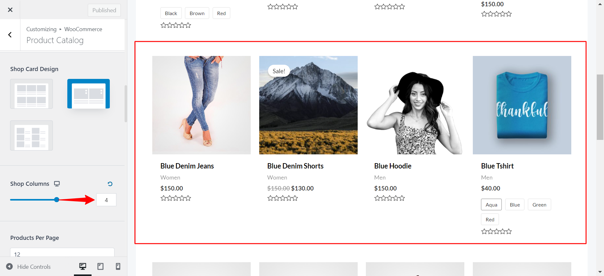
You have control to choose the number of columns on your responsive devices:
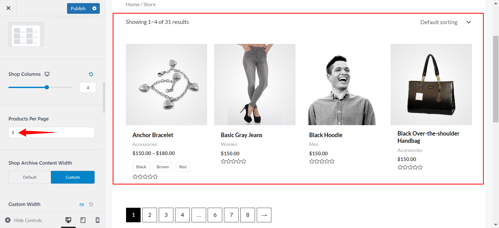
Products Per Page
Just like the Blog posts on the archive page, you have control to decide the number of products on the main shop page.
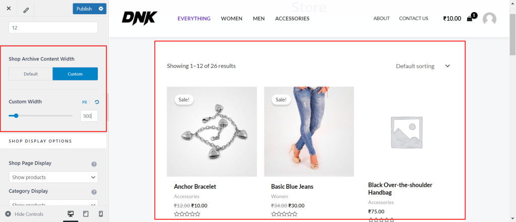
Shop Archive Content Width
You can control the width of your shop archive pages to ensure they fit perfectly with your website’s design and layout. This setting allows you to define how wide the content area should be on pages that display your product listings.
Shop Display Options
The Shop Page Display option lets you decide what content should be shown on the main shop page of your website. You can choose to display:
- Products: Show all the products available in your store directly on the main shop page.
- Categories: Display only the product categories, which can help customers navigate to the type of products they’re interested in.
- Both Products and Categories: Display a mix of product categories and individual products on the same page, providing a comprehensive shopping experience.
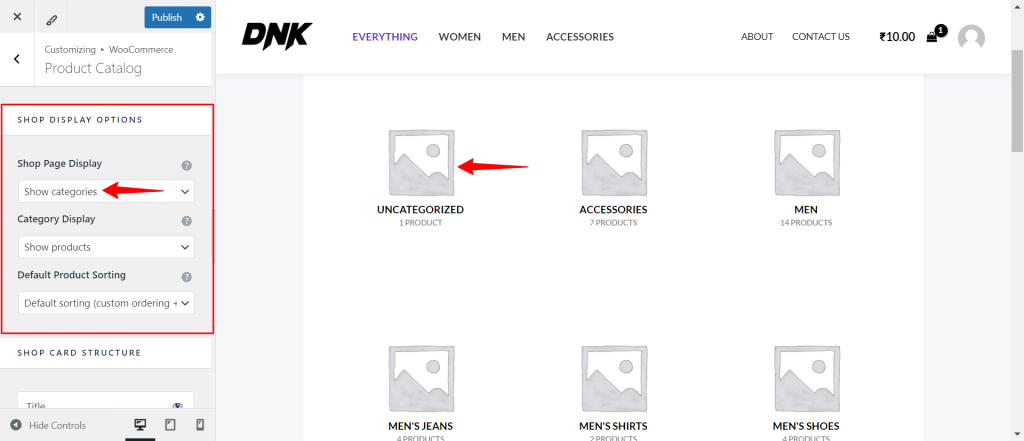
With the Category Display option, you can determine what shows up on your product category pages. Similar to the Shop Page Display, you can choose to display:
- Products: List all products within a specific category.
- Subcategories: Show subcategories to help customers refine their search.
- Both Products and Subcategories: Combine both options to give customers a full view of what’s available in each category.
The Default Product Sorting option allows you to define how products are sorted by default when customers view your catalog. This helps guide the shopping experience and can highlight certain products. The available sorting options typically include:
- Sort by Popularity: Products are sorted based on their popularity, often determined by sales or customer ratings.
- Sort by Average Rating: Products are displayed according to their average customer ratings.
- Sort by Newness: Newer products appear at the top of the list.
- Sort by Price: Products are sorted by price, either from low to high or high to low.
- Default Sorting (Custom Order + Name): The default sorting that includes any custom sorting you’ve set, followed by alphabetical order.
Choosing the right default sorting option can help improve customer satisfaction by making it easier for them to find what they’re looking for.
Shop Card Structure
Astra provides an easy way to customize the shop card structure using an eye icon. This icon allows you to enable or disable specific elements on each product card. The elements you can control include:
- Title: Toggle the visibility of the product title.
- Category: Choose whether to display the product’s category.
- Price: Show or hide the product price.
- Ratings: Display customer ratings for the product.
- Short Description: Include a brief description of the product to provide more context to shoppers.
- Add to Cart Button: Enable or disable the “Add to Cart” button, which allows customers to add the product to their cart directly from the card.
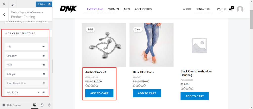
By adjusting these options, you can create a clean and functional product display that highlights the most important information for your customers.
Toolbar Structure
Astra provides an easy-to-use eye icon that lets you enable or disable specific elements within the toolbar. The key elements you can control include:
- Result Count: This shows the total number of products that match the current search or filter criteria. You can enable this to inform customers of the number of available products or disable it for a cleaner look.
- Filter: The filter option allows customers to refine their search results based on categories, price ranges, attributes, or other criteria. Enabling the filter can improve navigation, while disabling it can create a simpler toolbar.
- Sorting: This element allows customers to sort products by different criteria, such as price, popularity, or rating. You can choose to display or hide the sorting options depending on your store’s needs.
- Easy List View: The easy list view toggle gives customers the option to switch between grid and list views of products. Enabling this feature provides more flexibility in how customers browse your products, while disabling it keeps the presentation consistent.
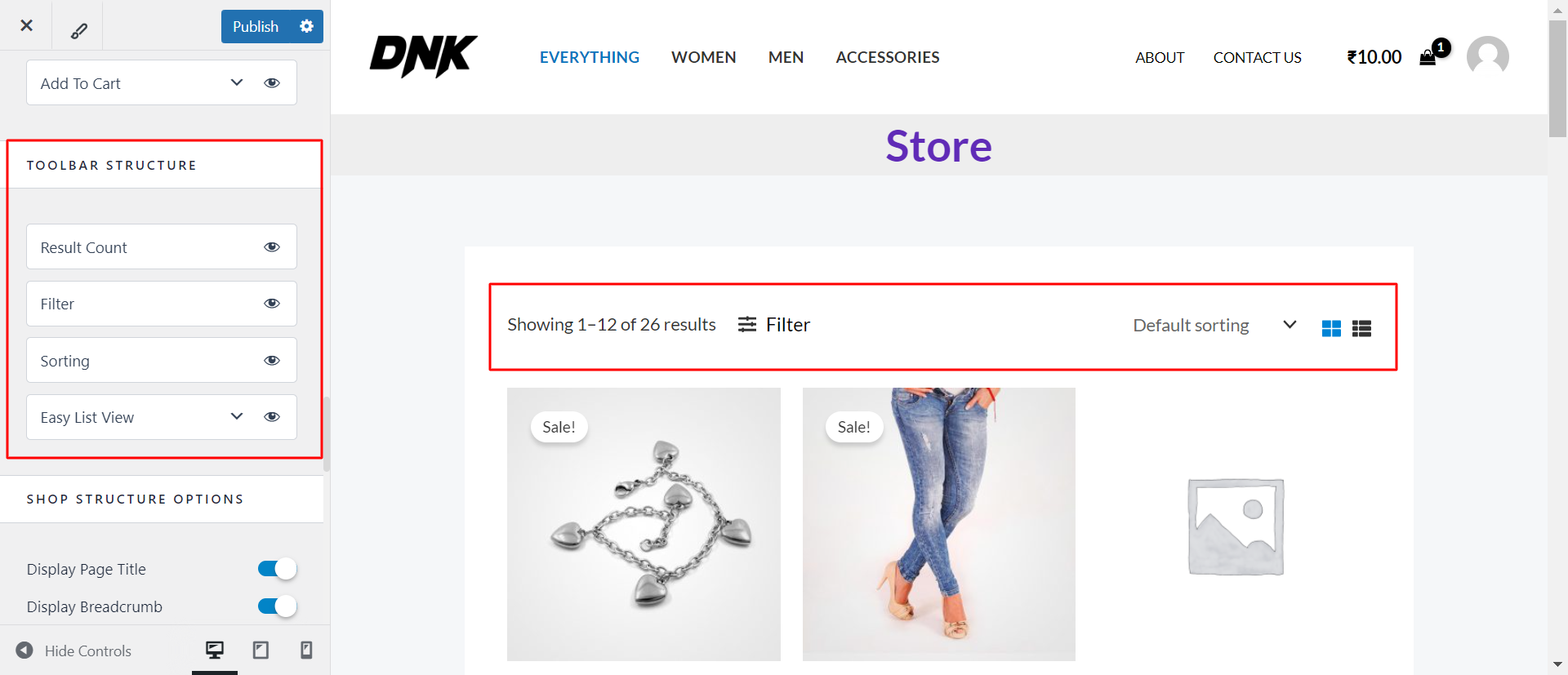
By adjusting these options, you can create a toolbar that perfectly aligns with your store’s design and user experience goals.
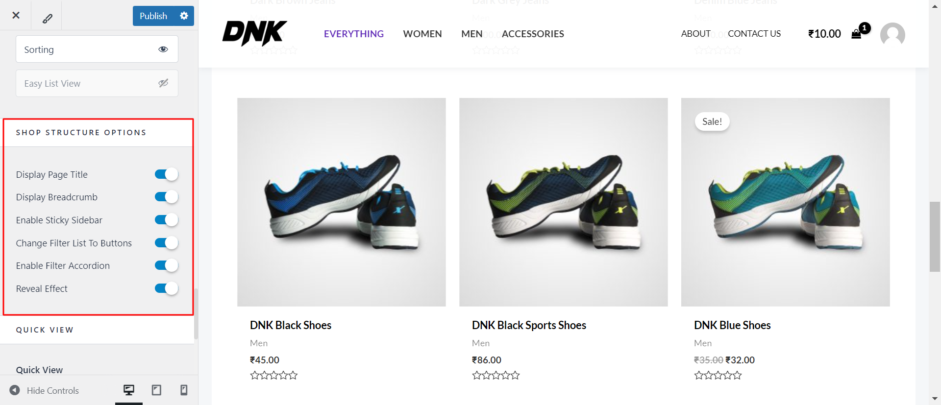
Shop Structure Options
Astra offers several toggles within the Shop Structure settings that let you control various aspects of your shop’s appearance and functionality:
- Display Page Title: This toggle allows you to show or hide the page title at the top of your shop pages. Enabling this helps to clearly define the content of the page for your visitors.
- Display Breadcrumbs: Breadcrumbs are a navigational aid that shows the path a visitor has taken to reach the current page. You can enable or disable this feature to help users easily backtrack to previous categories or sections.
- Enable Sticky Sidebar: The sticky sidebar remains visible as users scroll down the page. This is particularly useful for keeping important filters or navigation options accessible at all times. You can toggle this feature on or off depending on your design preferences.
- Change Filter List to Button: This option allows you to switch the display of your filter options from a list to a button. This can help save space on the page and provide a cleaner, more modern look. When enabled, filters are hidden under a button that users can click to reveal the options.
- Enable Filter Accordion: When this toggle is enabled, your filter options will be displayed in an accordion style, where only one section of filters is expanded at a time. This keeps the filter area organized and compact, making it easier for users to find what they’re looking for.
- Reveal Effect: This toggle controls a visual effect where elements are revealed as the user scrolls down the page. Enabling this effect adds a dynamic touch to your shop’s presentation, enhancing the overall user experience.
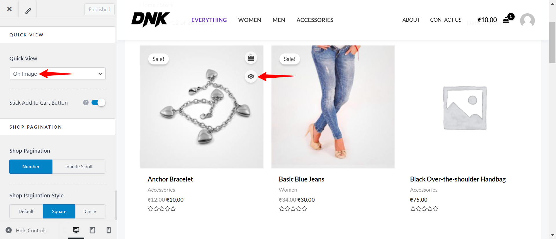
Quick View
Under the Quick View settings, you can choose from different options that determine how the Quick View feature is activated. These options include:
- Disabled: If you select this option, the Quick View feature will be completely turned off, and customers won’t be able to access it.
- On Image: When this option is enabled, the Quick View eye icon appears directly on the product image. This makes it easy for customers to see that they can view more details with a simple click.
- On Image Click: With this setting, the Quick View feature is triggered when a customer clicks on the product image itself, rather than a separate button. This provides a seamless experience for users who are used to clicking images to see more details.
- After Summary: This option places the Quick View button after the product summary (typically the product title and price). It gives a more traditional placement for those who prefer to keep product interaction separate from the image area.
Shop Pagination
Number
The number option restricts the number of products on an individual page. The remaining undisplayed products are divided into further pages
Shop Pagination Style
You can change the change this style to Circle or Square
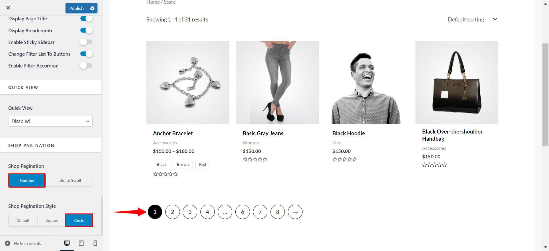
Infinite Scroll
This option on the product page stands for the unlimited display of products. The page gets extended as far as you keep adding the products on the product archive page with an infinite scroll.
Event to Trigger Infinite Loading
Scroll
Keeps you scrolling the page.
Click
The Scroll may elongate the page and the viewer may lose interest after scrolling at a certain level. To avoid this choose an option of Click where the Load More button appears.
This button appears after a certain number of products are displayed in rows. You can change the button text as per your needs.
More Documents –
